How It Was Built
One person. One AI. Seven sessions. Here's how Lenny's Multiverse came together — from a blank screen to a fully mobile-optimized interactive constellation of 290 podcast guests with embedded videos and AI-powered conversations.
The Starting Point
Lenny's Podcast has hosted 290+ incredible guests — founders, product leaders, growth experts, AI researchers — across 349 episodes. That's over 8.8 million words of wisdom about building products, growing companies, and navigating careers.
But here's the thing: when you're scrolling through a list of 349 episodes, it's hard to see the big picture. Which guests overlap? Who talks about similar things? Where should youstart based on what you're going through right now?
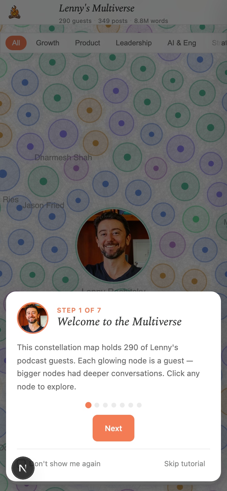
I wanted to turn that list into something you could see and explore— a living map where every guest is a dot, connected to others who share their expertise. And then I wanted to let you actually talk to them.
What You Can Do With It
By the Numbers
How I Actually Built It
I'm not a professional developer. I built this entire project by working with Claude Code— Anthropic's AI coding tool. I described what I wanted, and together we figured out how to make it happen.
The whole thing came together across seven working sessions. Total time from blank screen to live product? About a day and a half.
Session 1 — Getting Something on Screen ~4 hours
Started from nothing. By the end of this session, we had a working interactive graph with all 290 guests, topic filters, search, and a chat panel where you could talk to guests. Deployed it live the same day.
Session 2 — Making It Smart ~3 hours
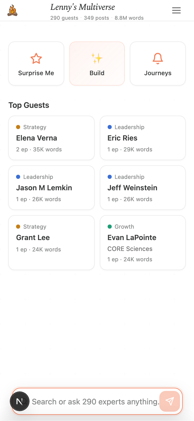
This is where it got interesting. We added the personalized multiverse builder (“tell me about you, I'll pick the right guests”), grounded the conversations in real podcast quotes using Lenny's Data, and created 6 guided journey paths.
Session 3 — Going Deeper ~3 hours
Added the ability to dive into specific episodes — see every episode a guest appeared in, read it on Substack, or start a conversation scoped to just that episode. Also matched 87% of episodes to their original Substack links so you can always find the source.
Session 4 — Making It Beautiful ~3 hours
Redesigned everything to match Lenny's Newsletter branding. Added the share feature so you can send your curated multiverse to a friend with just a link. Refined all the interactions and added the floating control bar at the bottom.
Session 5 — Making It Solid ~3 hours
Added 43 automated tests to make sure nothing breaks. Made everything work on phones and tablets. Sped up load times. Expanded the real podcast quotes from 14 guests to 47. Wrote this very page.
Session 6 — Making It Delightful ~4 hours
This session was all about polish and immersion. Added a 7-step onboarding tutorial with Lenny guiding you through the experience. Built a “Surprise Me” feature that spotlights a random guest with their connected constellation. Added Lenny's face to his center node, and guest headshot images that appear when a node is in focus. Embedded YouTube videos directly in episode cards so you can watch without leaving the site — matched 89% of episodes to their exact YouTube videos. Added a smart reset button that appears whenever you've drifted from the default view. Finished with full SEO optimization: structured data, sitemap, security headers, and caching.
Session 7 — Mobile-First Polish ~3 hours
The final session was all about making the experience feel native on phones and tablets. Added responsive zoom scaling so the constellation is actually visible on small screens (not a field of faint dots). Fixed viewport overflow issues where the D3 graph was expanding past the screen on mobile Safari. Added touch-action: none to prevent iOS back-swipe from hijacking graph interactions. Built touch feedback (:activestates) on every tappable element — buttons, cards, pills, links. Increased all tap targets to 40px+ for reliable finger-tapping. Added a condensed stats row on mobile so you still see “290 guests · 349 posts · 8.8M words” even when the desktop header is too wide. Fixed safe area insets for notched iPhones. Updated all 42 Playwright tests that had broken when the search UI was refactored to the AskMultiverse bar.
Session 8 — The Mobile Rethink ~6 hours
Threw out the idea of making the desktop work on mobile and started over. Replaced the D3 constellation with a purpose-built mobile discovery hub. Went through bottom sheets, full-page views, a floating action button, and spent hours debugging an iOS horizontal overflow bug that only appeared on real iPhones. The full story is below.
Total build time: ~29 hours across 8 sessions. That includes every feature you see, all the data processing, testing, and deployment. Not bad for a solo project.
How Claude Powers the Experience
Claude (Anthropic's AI) isn't just behind the scenes — it's woven into everything you interact with:
Fun Problems We Solved
The Hairball Problem
The first version of the graph drew a line between every pair of guests who shared a topic. That created over 15,000 connections — it looked like a ball of yarn, not a constellation. We tuned it down to 2,660 meaningful connections where the relationships actually tell you something useful.
Keeping Conversations Real
AI can sound convincing even when it's wrong. The biggest design challenge was making sure guest conversations reflect what people actually said, not what the AI thinks they might say. The solution: feed real podcast excerpts into every conversation and mark which chats are grounded in real content.
The Name Game
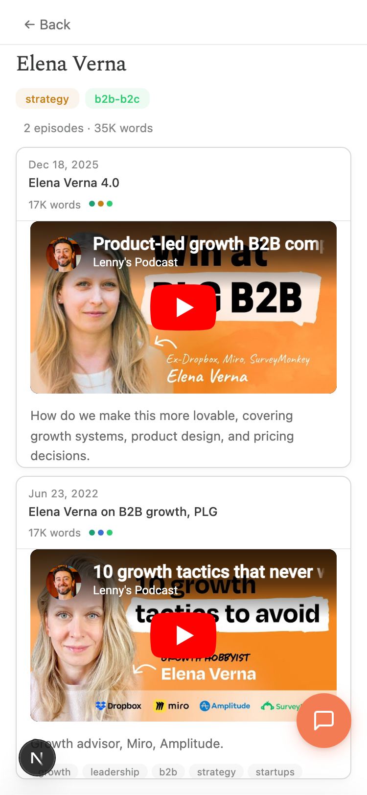
The same guest might appear as “Elena Verna,” “Elena Verna 2.0,” “Elena Verna 3.0,” and “Elena Verna 4.0” across repeat appearances. Episodes with two guests like “Jake Knapp + John Zeratsky” needed to be split into separate entries. Getting 290 clean guest identities from messy real-world data was a puzzle in itself.
Making the Map Feel Alive
A static diagram of 290 dots isn't very interesting. The graph uses a physics simulation — guests gently pull toward others who share their topics, creating natural clusters. When you filter by “AI,” the relevant guests light up and the view smoothly zooms to frame them. It makes exploring feel like discovery, not data analysis.
Matching 344 YouTube Videos to 291 Episodes
The podcast data has episode titles, but no YouTube links. We used yt-dlpto dump all 344 video IDs from the @LennysPodcast channel, then fuzzy-matched them to episodes by guest name and title keywords — handling diacritics (Tobi Lütke → Lutke), name spelling variations (Yamashita vs Yamashata), and multi-appearance guests like Elena Verna who needed deduplication so her four episodes didn't all point to the same video. Final result: 89% matched.
The Reset Button That Knows When You Need It
With zoom, pan, filters, guest selection, journeys, and Surprise Me all changing the view, knowing when to show a “Reset” button was surprisingly tricky. D3's zoom events distinguish user-initiated actions (which have a sourceEvent) from programmatic ones (which don't), but clicking a node triggers a programmatic zoom — so we had to explicitly flag that too. The button also needed to be accessible whether the bottom dock was visible or hidden behind a panel, leading to a dual-placement approach.
Making a Desktop D3 Graph Work on Mobile
D3 creates an SVG sized to window.innerWidth × window.innerHeight, which on mobile Safari can be larger than the visual viewport (because innerHeight includes the URL bar). This caused the SVG to push the page past the screen edge, breaking all fixed-position elements. The fix was a combination of overflow: hidden on the container, position: fixed on the body, 100dvhfor panel heights, and a responsive zoom function that returns 1.2× on phones (instead of the desktop 0.55×) so nodes are actually visible. Then every tap target needed to be audited for 44px minimum size, every :hover state needed an :active counterpart for touch, and safe-area insets needed to account for the iPhone notch.
The Mobile Retro: From Desktop Disaster to Purpose-Built
If you've ever tried to take a desktop web app and make it work on a phone, you know the feeling. You open it on your iPhone, squint at the screen, and think: “This is going to be fine. I just need a few CSS tweaks.”
It was not fine. Here's what actually happened — in case you're about to attempt the same thing.
Stage 1: “It'll just work”
The Multiverse was designed as a desktop experience — a big, beautiful constellation map where you zoom, pan, and click glowing nodes. On a phone, this translated to: a sea of tiny circles you can't tap, text labels overlapping each other, filter pills scrolling off the edge of the screen, and a bottom toolbar crammed below the fold. The onboarding tutorial covered the entire screen. It was, to put it gently, unusable.
My first instinct was the classic one: “Just add some responsive CSS.” Hide a few things here, shrink a few things there, maybe bump up the zoom level. This is the trap. It almostworks, which means you keep going, and keep going, until you're 20 patches deep into a fundamentally broken approach.
Stage 2: Accepting the D3 graph won't work
After hiding the onboarding, tweaking zoom levels, adding a hamburger menu, and hiding the filter pills — I had to face the truth. A force-directed graph with 290 nodes and 2,660 connections just doesn't work on a 375-pixel-wide screen. The nodes are too small to tap. The labels overlap. You can't tell what you're looking at. No amount of CSS will fix a fundamental interaction design problem.
So I ripped it out. On mobile, the D3 constellation is gone entirely. In its place: a purpose-built discovery hub with a scrollable guest directory, topic filters, and a recent episodes carousel. Same data, completely different interface.
Stage 3: The bottom sheet era (RIP)
With the new card-based home screen, I needed a way to show guest details. The obvious mobile pattern: bottom sheets. Slide up from the bottom, 90% of the screen, swipe to close. Every app does this. Should be simple.
It was not simple. On iOS, bottom sheets fight with the browser's own scroll mechanics. The sheet scrolls, but so does the page behind it. Bounce scrolling triggers at weird times. The content inside the sheet sometimes won't scroll at all. I spent commit after commit trying to make sheets work:min-height: 0 on flex containers, overflow: hidden on the body,overscroll-behaviorto kill bounce — each fix broke something else.
Eventually I gave up on sheets entirely. The replacement: full-page views with a simple “Back” button. No scroll fighting, no overflow hacks, no iOS surprises. Sometimes the boring solution is the right one.
Stage 4: The floating action button
With the desktop layout, search and chat input had dedicated spots: search bar above the bottom dock, chat input pinned to the bottom of the guest panel. On mobile, both of these ate precious screen space. The search bar pushed content down. The chat input competed with the keyboard.
The fix: one orange floating action button in the bottom-right corner that knows where you are. On the home screen, it's a search icon — tap it to search guests or ask the multiverse a question. On a guest's page, it becomes a chat bubble — tap it to start a conversation with that guest. One button, two contexts, zero screen real estate wasted.
Stage 5: The iOS overflow saga
This was the one that nearly broke me. Everything looked perfect in the browser's mobile emulator. But on a real iPhone (Chrome, which uses Safari's WebKit engine under the hood), the entire page was shifted slightly to the right. Maybe 5–10 pixels. You could scroll horizontally just a tiny bit — enough to see a sliver of white on the left. The right edge of guest cards, the menu icon, the FAB — all slightly clipped.
I tried everything the internet suggests: overflow: hidden on the body, overflow-x: clip on every container, max-width: 100% everywhere, wrapping horizontal scroll areas inoverflow: hidden parents, making containers position: fixedso they're exactly viewport-sized. None of it worked on the actual phone.
The breakthrough came from a clue the user (me, testing on my iPhone) noticed: “If I zoom in and let go, it snaps back to the correct width.” That meant iOS was auto-expanding the viewport to fit content it thought was wider than the screen.
The culprit: the recent guests carousel. It's a horizontal scroll container with items that extend past the viewport (that's what horizontal scrolling is). Even though those items are clipped visually by overflow: hidden, iOS WebKit still measures their positions when calculating the page width. And here's the kicker: on iOS, if you set overflow-x: hidden andoverflow-y: auto on the same element, the browser quietly converts overflow-x toauto too. Your horizontal clipping just disappears.
The fix was two lines of CSS: contain: painton the outer container tells the browser “nothing inside this element affects layout outside it.” And splitting the scroll area into an outer box (fixed position, overflow hidden, contain paint) and an inner scroll wrapper (overflow-y auto) so the two overflow axes are never mixed on the same element.
Six hours. Thirty commits. Two lines of CSS.
What I'd tell myself (and you) before starting
- Don't try to make the desktop work on mobile.If your desktop experience relies on hover states, spatial layouts, or interactions that assume a large screen and a mouse — build a separate mobile experience. It'll take less time than patching the desktop one.
- Test on a real phone, not just the emulator. The Chrome DevTools mobile view lies to you. iOS WebKit has behaviors (viewport expansion, overflow coercion, safe area handling) that only show up on actual hardware.
- Simple beats clever on mobile.Full-page views beat bottom sheets. A floating button beats a persistent search bar. A scrollable list beats an interactive graph. The patterns that feel “basic” are basic because they work.
- iOS overflow rules are different. The CSS spec says you can mix
overflow-x: hiddenwithoverflow-y: auto. iOS WebKit says no. Learn aboutcontain: paintbefore you need it — it'll save you hours. - Your vibe-coded app is a desktop app.If you built something with AI assistance in a few sessions, chances are it was designed for the screen you were looking at: a laptop. That's fine. But mobile isn't a CSS media query away — it's a different product.
What I Learned
Building this taught me a few things worth sharing:
- AI-assisted coding is a superpower— I went from an idea to a deployed, polished product in seven sessions. A few years ago, this would have taken me months (if I could have built it at all).
- The data is the hard part— The flashy graph is what people see, but 80% of the work was cleaning names, merging duplicates, matching URLs, and extracting meaningful excerpts.
- Grounding matters— AI conversations are only as valuable as the source material behind them. The difference between a generic AI response and one backed by real podcast quotes is night and day.
- Ship early, polish later— Session 1 got a working prototype live in a few hours. Four more sessions refined it. The best feedback came from having something real to click on.